IRIDESCENCE
Poster Series
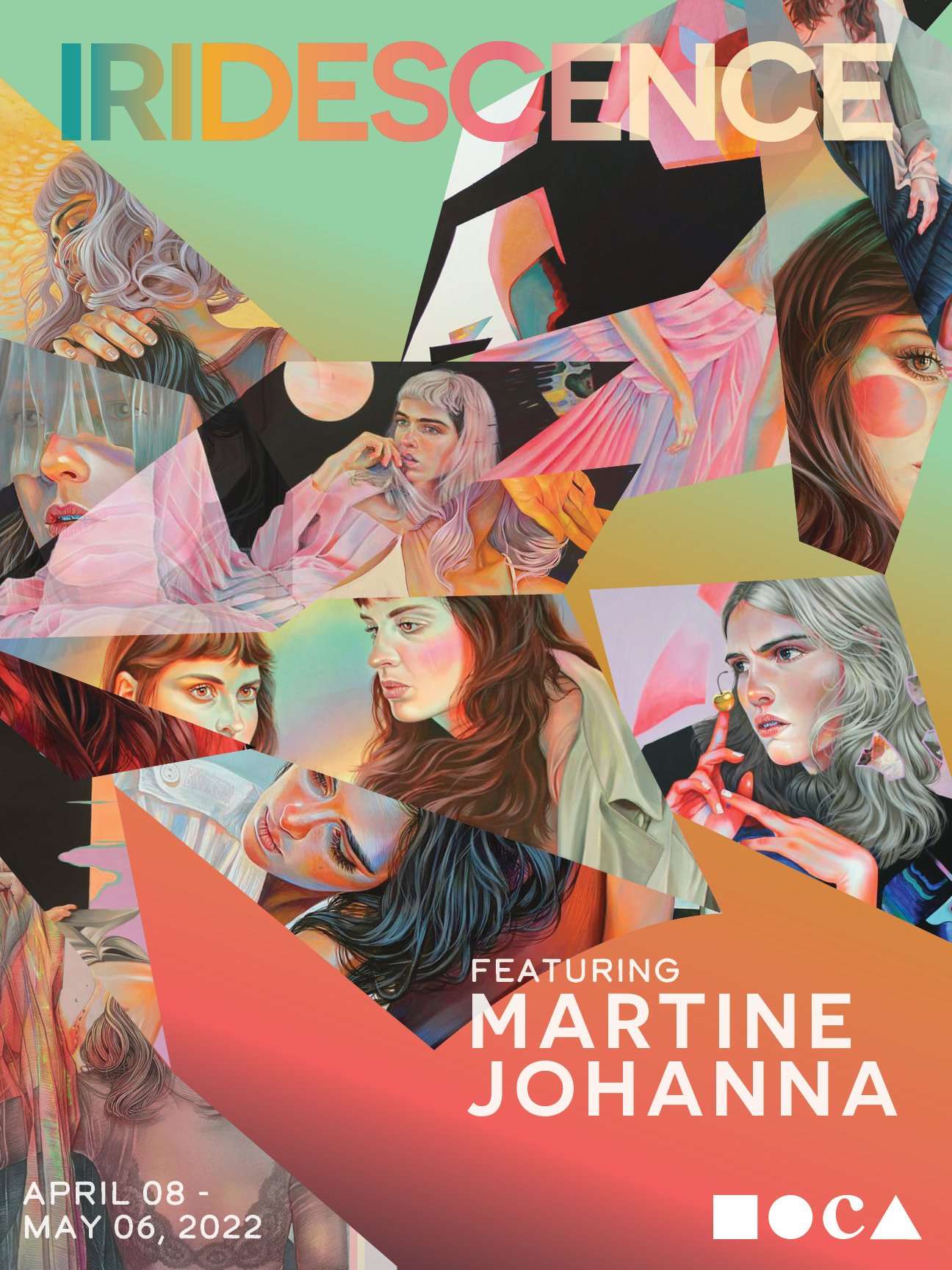
Gallery exhibit titled IRIDESCENCE features three female contemporary artists Martine Johanna, Jenny Morgan, and Fuco Ueda. Admiring all three artists, I wanted to showcase their work in the creation of this project.
I wanted to highlight and portray the unique range of color and subject matter these artists use throughout their work. The common link between these artists is their vibrant palette choices, and female gender-focused subjects.


Cohesive Poster System
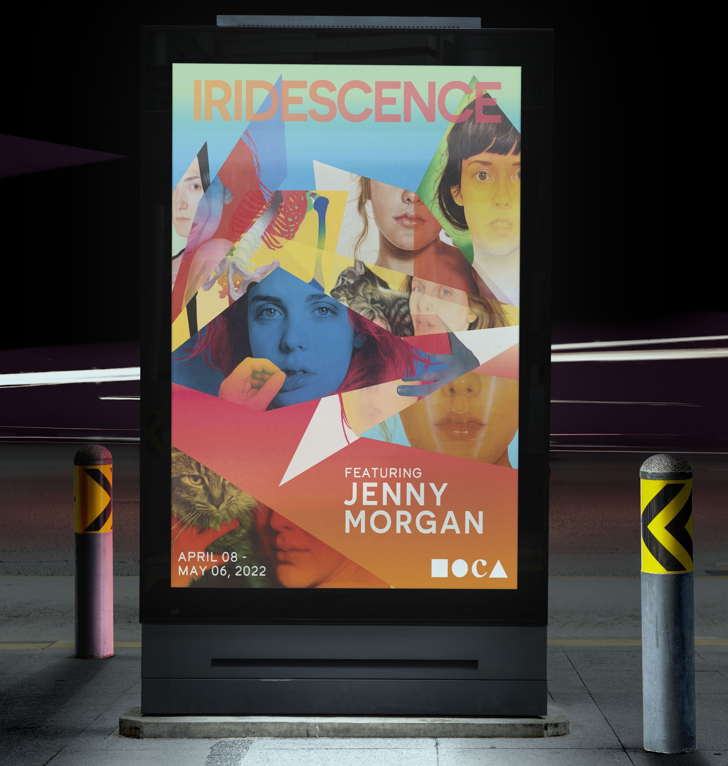
Each poster is dedicated to a different artist. Similarities to create a cohesive poster system, differences to differentiate each artist. a look into the artist's work that will be on display in the gallery. Work by each artist, fragmented to show multiple works while also leaning into the “Iridescent” aspect of the show by showing a range of color, using different opacities and overlapping imagery — the fragments of imagery resemble shards of mirrors.
Typography
The titles are san-serif fonts filled with gradients that both contrasted as well as complemented the background gradients. The dates of the show use a rounded san-serif type that differs from the other two typefaces to call attention to this area, the rounded edges contrast the sharpness of the other typefaces and the sharpness of the fragments for the imagery.
Color Palette
The main tie to each artist is their love of color. — all three artists use a wide range of color in their work, there is a lot of color in each poster, the colors I used were inspired by the works by each artist. Creating a unique gradient based on the tone of each artist and their work, these colors helped individualize each poster and helped each artist stand out.


Advertising
As the designer, I had to consider where the posters could be displayed to bring in a larger audience to visit the exhibit. Places where the posters and advertising for the show can be seen are scattered throughout the city (billboards, bus stops, local businesses, etc.).


